This is a dynamic page – meaning I may update it with more dragons in the future. It is meant to be a place where I can just come and remember that the phrase “here be dragons” can be exciting.
I wouldn’t be a real nerd if I didn’t love dragons. I don’t just enjoy dragons as a concept, I have started a bit of a collection of different dragons, many of which I have built and painted myself. So, here are my many dragons.
The First Dragon
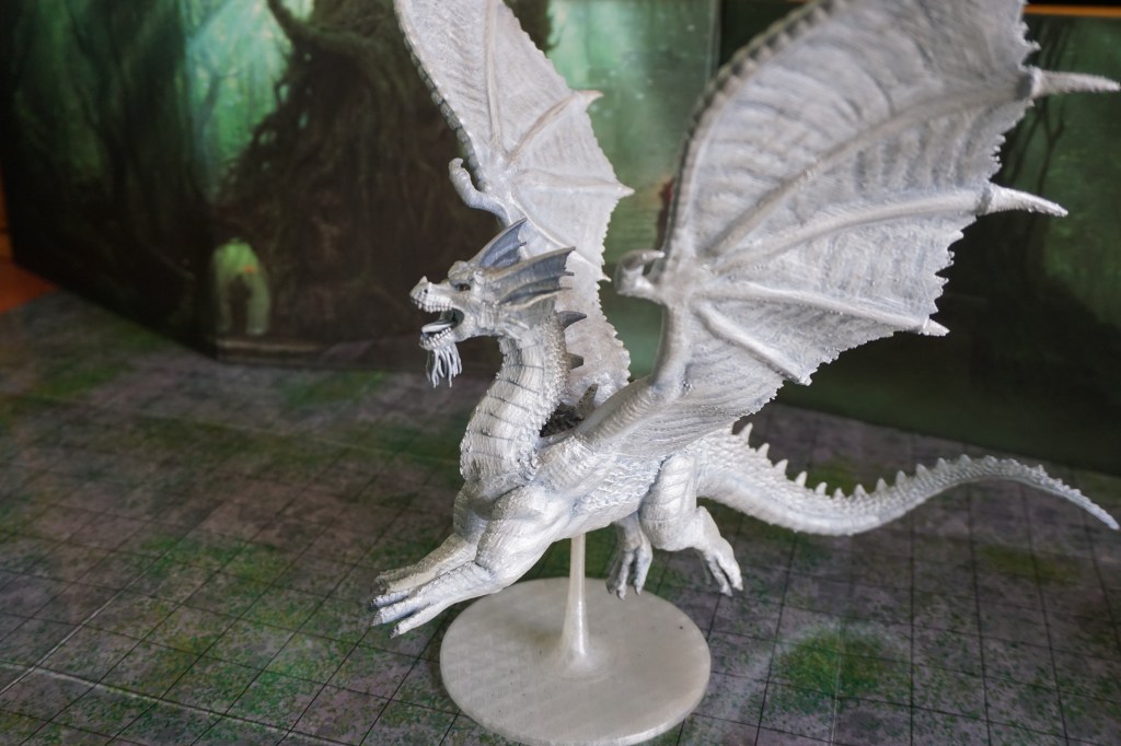
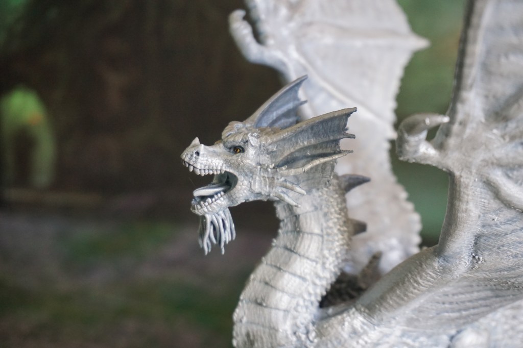
The first dragon I painted is this Silver Dragon from the WizKids Pathfinder collection. It was a gift from my sister when I started painting miniatures. You would be forgiven in not recognising it immediately as adult or silver, as I was still figuring out how to paint miniatures. It is not my best work, but it is still displayed with the others.
Tyranny of Dragons
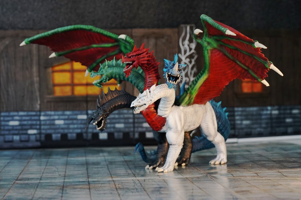
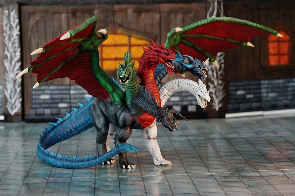
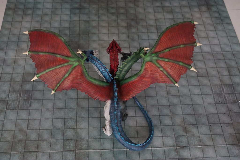
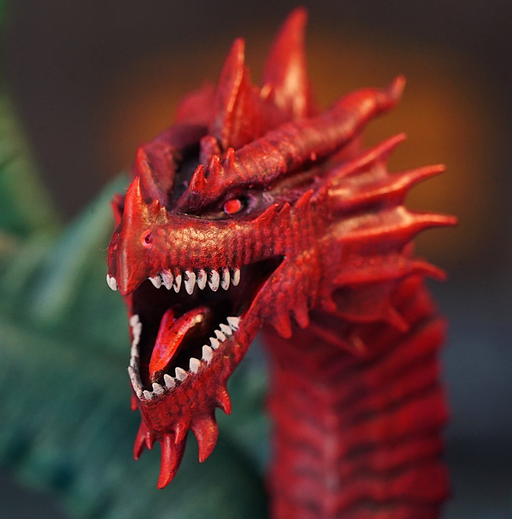
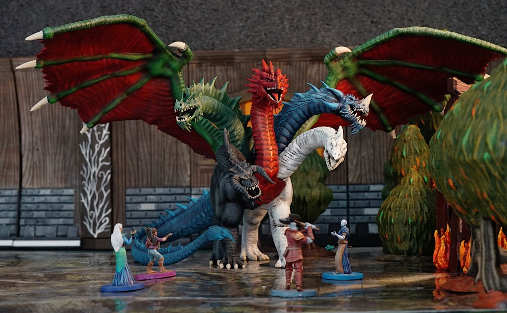
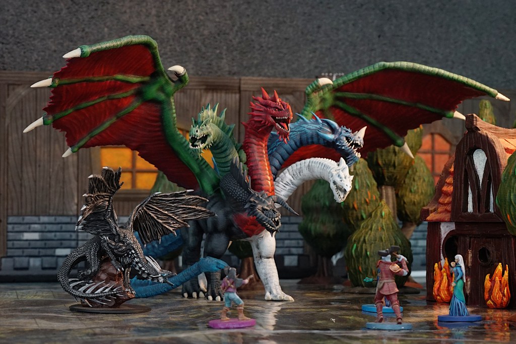
In 2021 I began running the Tyranny of Dragons campaign for the 5th edition of Dungeons and Dragons. Why? Because I wanted a quintessential dragon based campaign, and I figured it would be fun. The ultimate goal in the campaign (which was published so long ago that there are no spoilers here) is to ensure the evil dragon-god Tiamat cannot be raised from the depths of the Abyss. So of course I had to print her from the MZ4250 collection.
Tiamat brought the wonderful challenge of figuring out how to paint many different colours and tones, all in one ginormous creature. I chose non-traditional colouring, because honestly, I don’t think she would be a “red dragon with extra heads”. Instead I chose to incorporate the different chromatic types across her being.
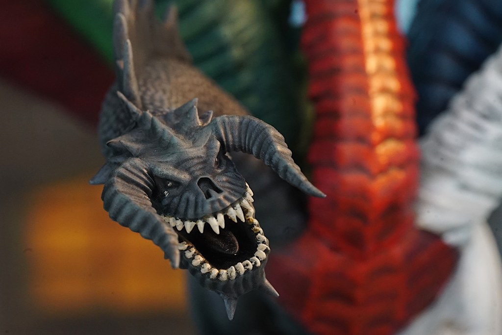
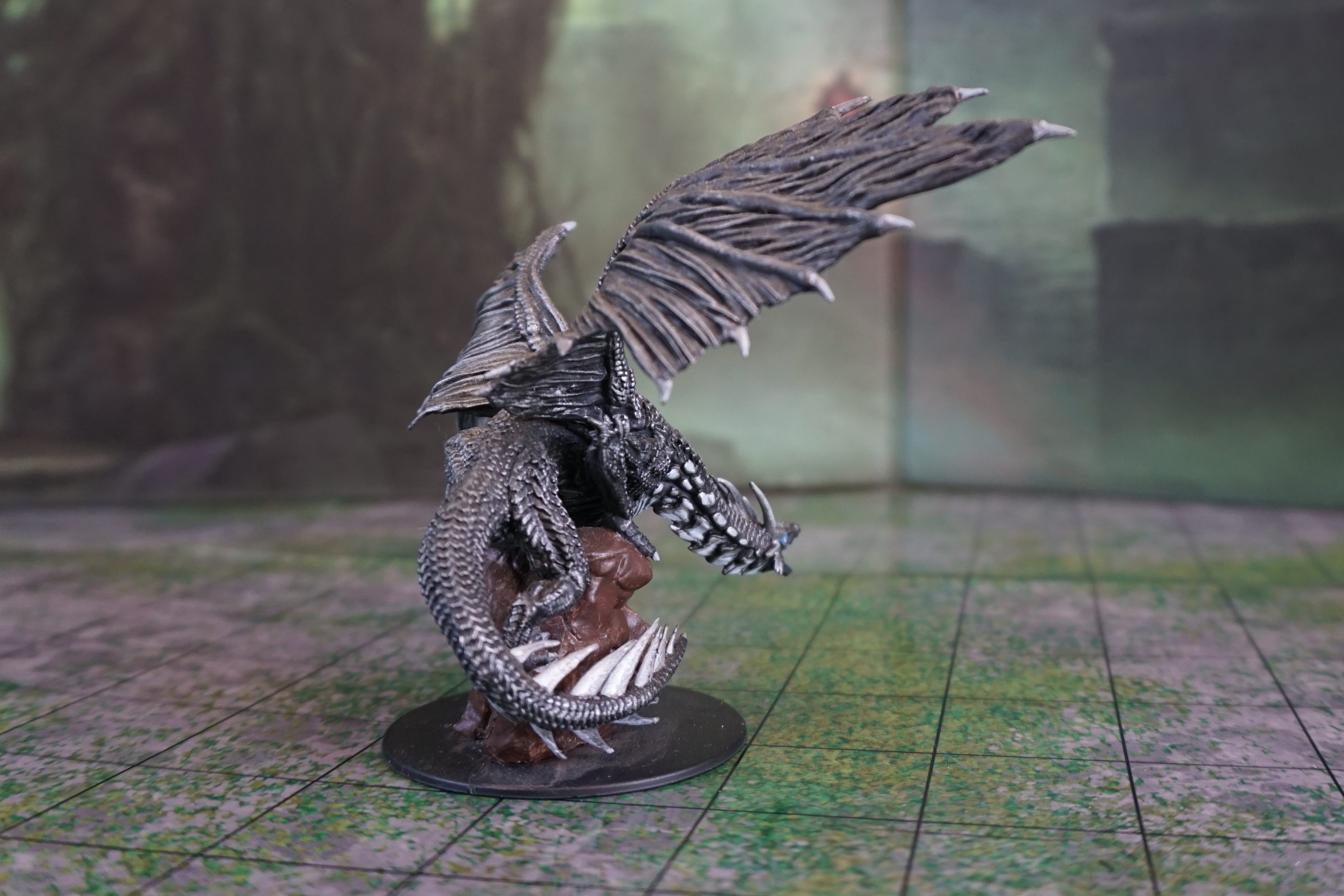
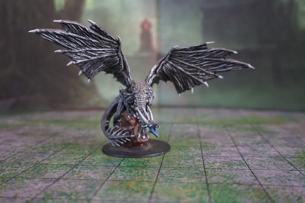
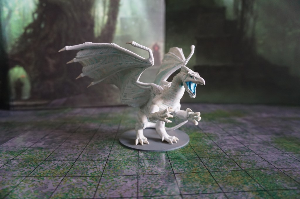
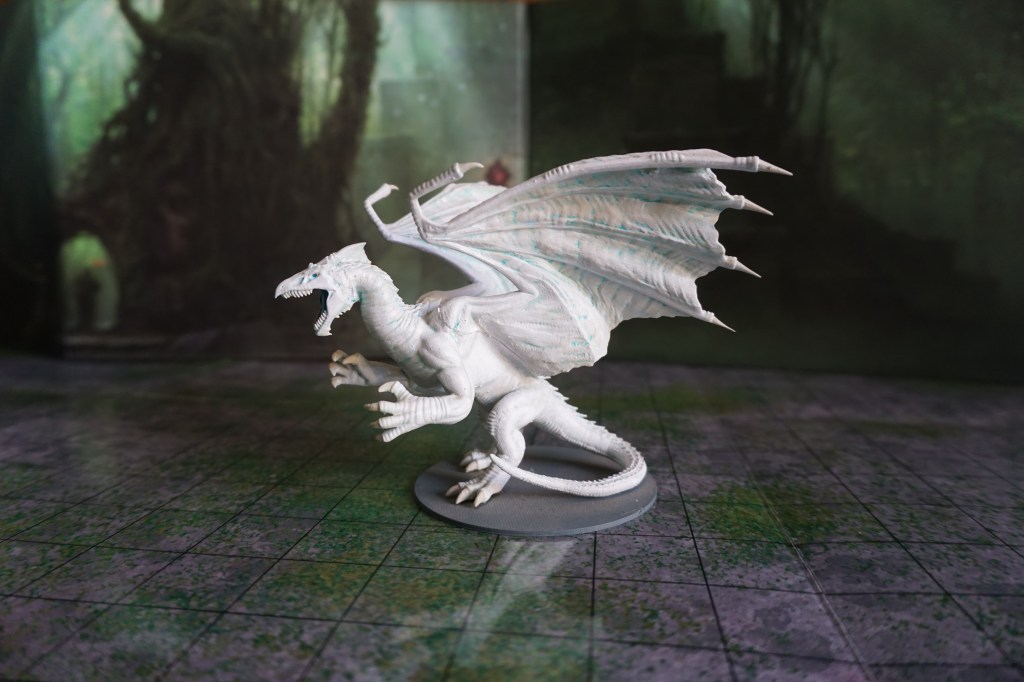
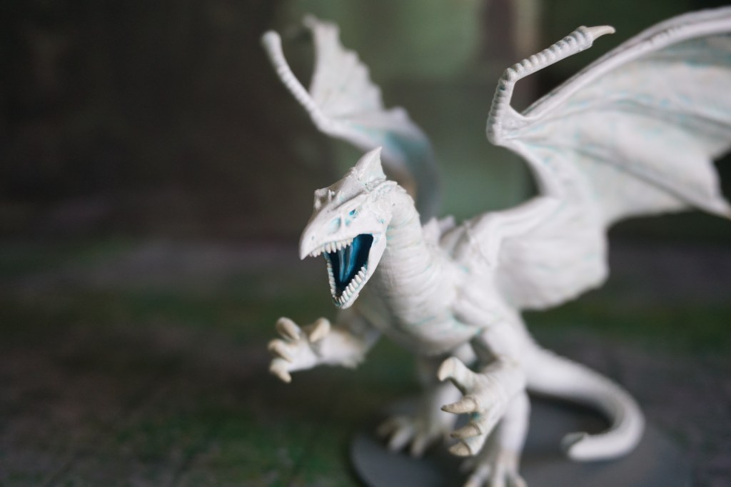
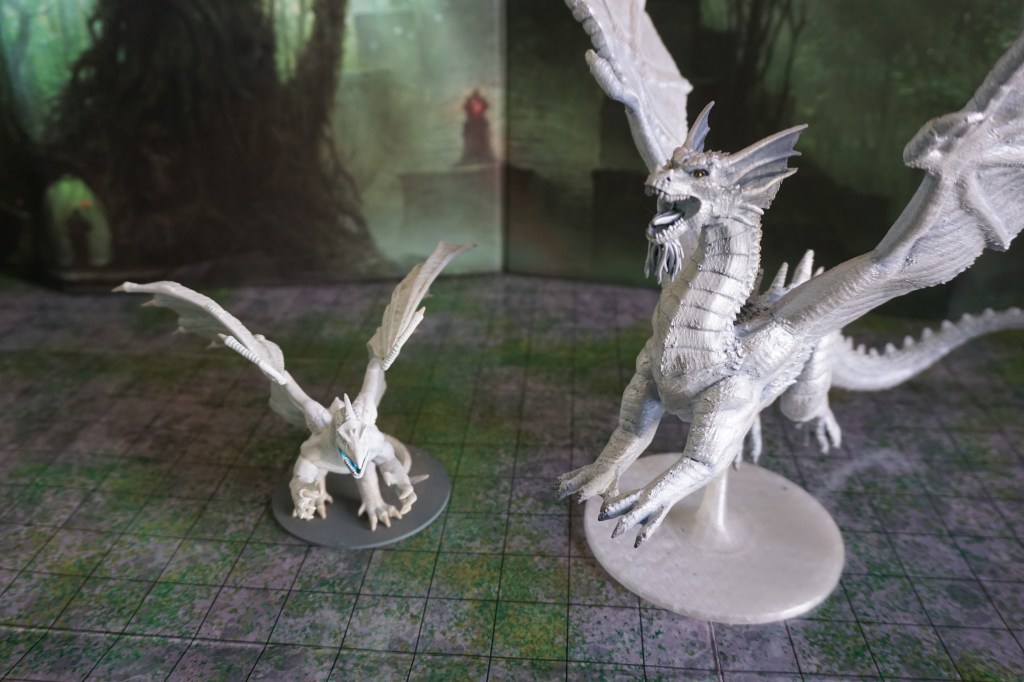
The first dragon to be encountered in the campaign was an adult white dragon. As when painting Tiamat herself, I found that adding depth to a white surface without it looking dirty can be quite challenging. Since the white dragon is associated with the element of ice, and can usually be found in icy caverns, I chose to use undertones of blue, and then work my way from a warm bone-white, to the cold arctic-white shown here.
Due to player choices, I had the opportunity to introduce the good dragon-god Bahamut. The platinum dragon brings a similar set of challenges to the white. How do you ensure he doesn’t read as either white or silver? How do you ensure he has depths to his shape and scales?
I chose to start with a grey/silver base and use washes and dry-brushing to make him ever lighter. Between that, and the use of a bright burnished gold for his eyes gave the effect I was looking for.
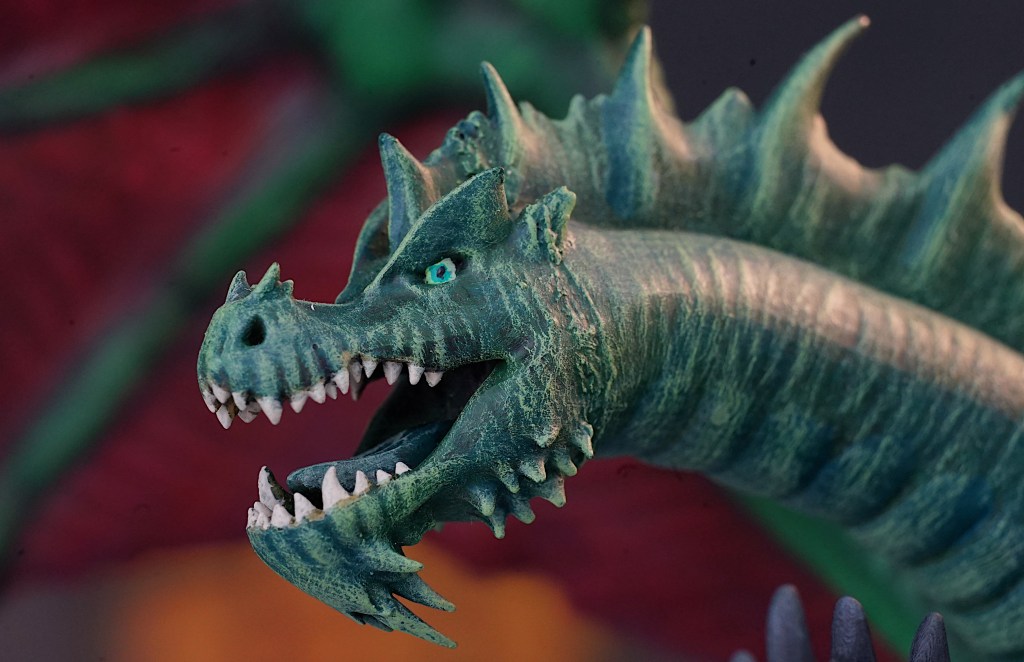
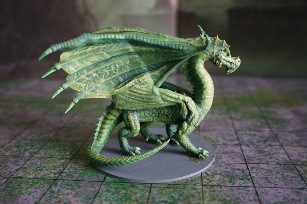
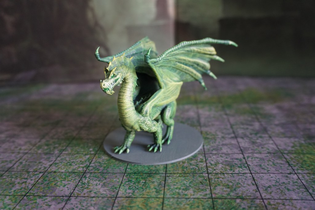
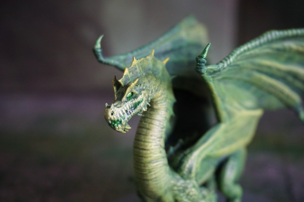
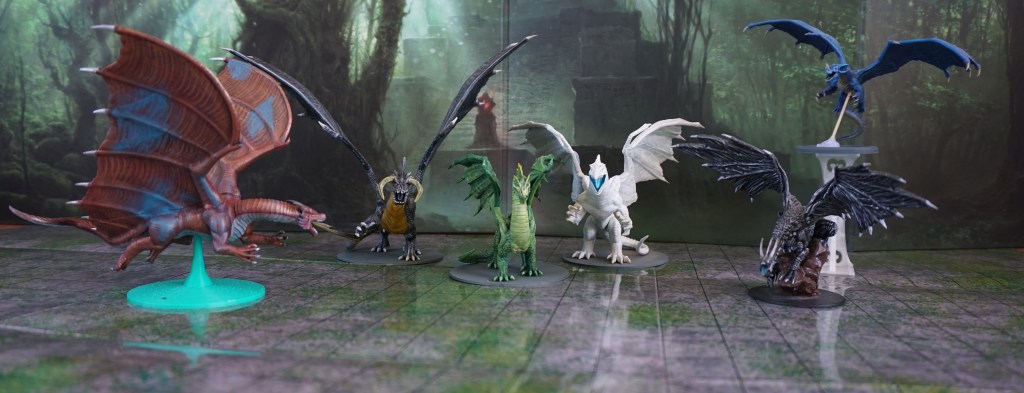
The next dragon I knew I would need was green. Smaller, and wilier than their white counterparts, the adult green is a delight to paint. Greens and yellows lend themselves to layering and dry brushing to pull out details and make them pop.
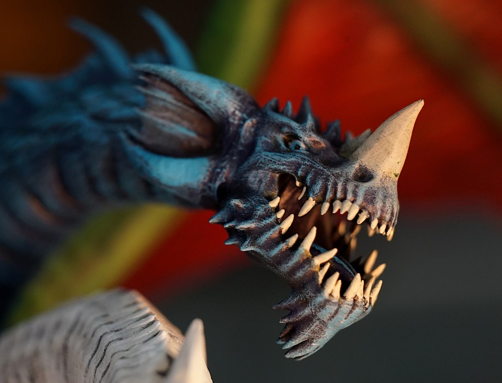
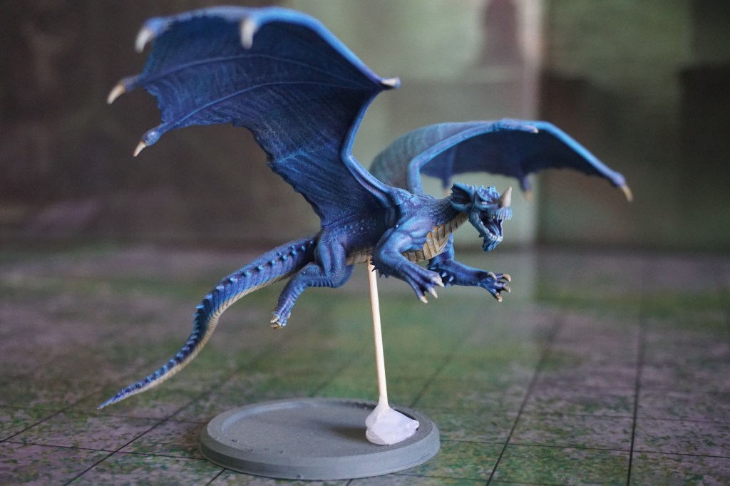
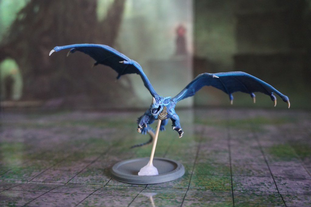
Before the players could actually meet the green dragon, they were introduced to a younger (smaller) blue dragon. Another colouration which I quite enjoyed painting. The blue dragon with his narwhal style horn and lightning affinity can be quite an impressive figure.
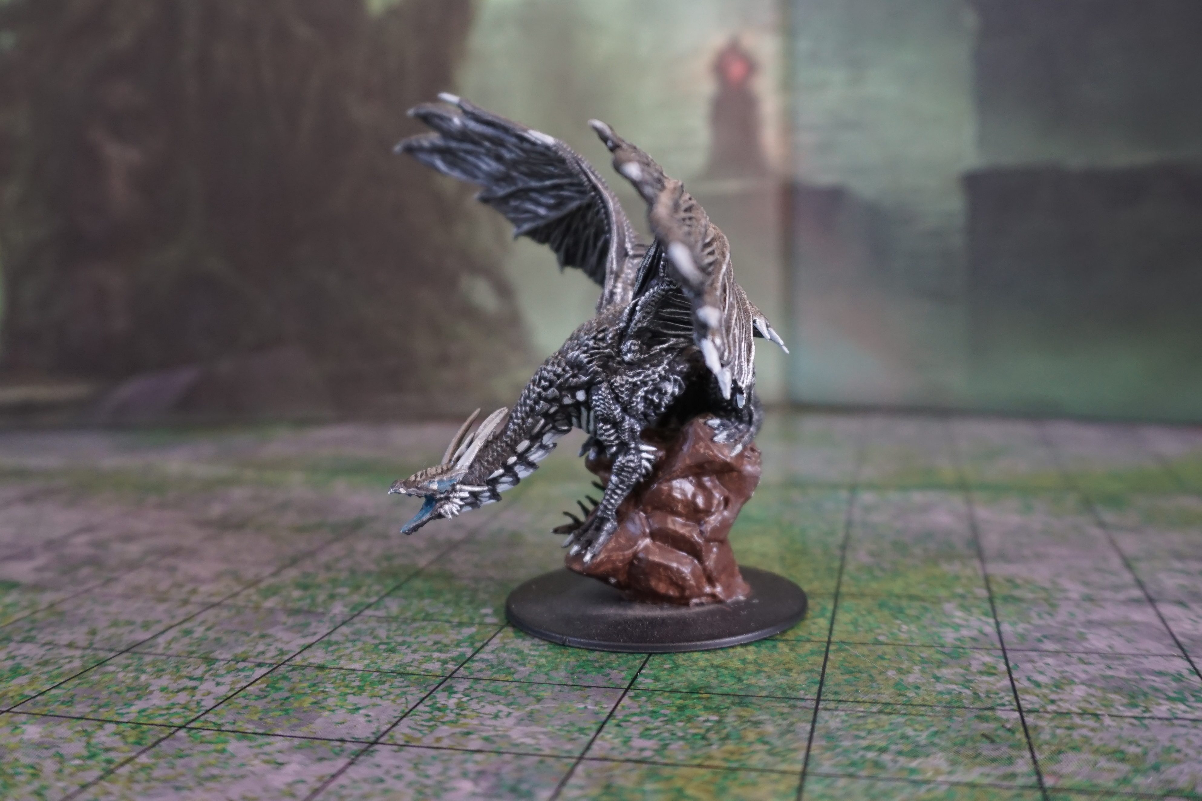
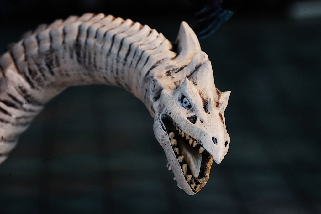
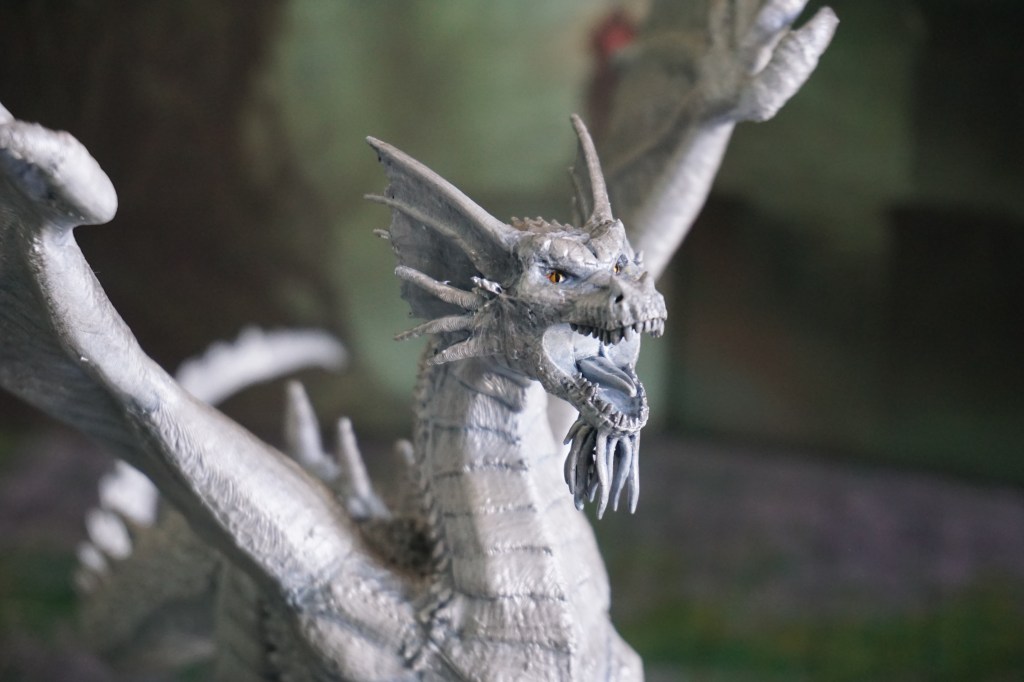
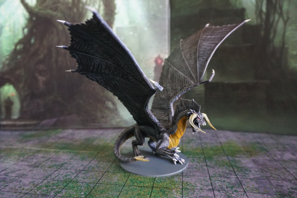
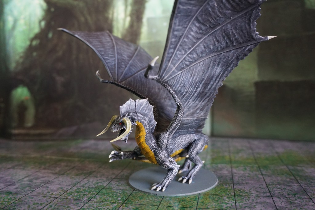
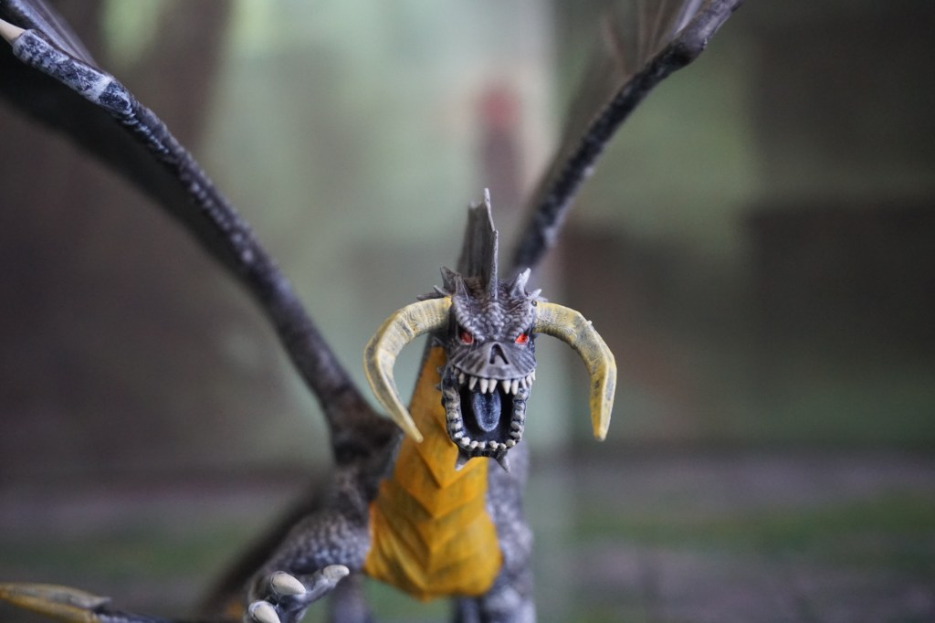
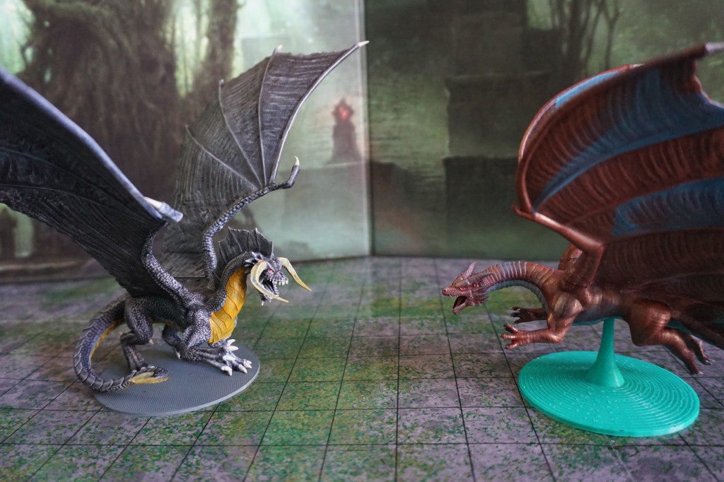
Again, chosen by story beats, I had the opportunity to bring in a black dragon. Spitting acid, and breaking buildings, this is one of the largest dragons.
Black, much like white, comes with an interesting challenge of creating depth in a miniature. The trick it to avoid the creature looking “dusty” or grey, but still having detail. You can do this in a number of different ways depending on what you’re going for. In this case I started dark, and then used dry brushing to make the details pop, since I was working to a self imposed clock.
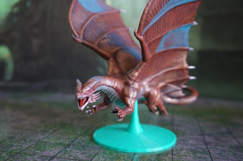
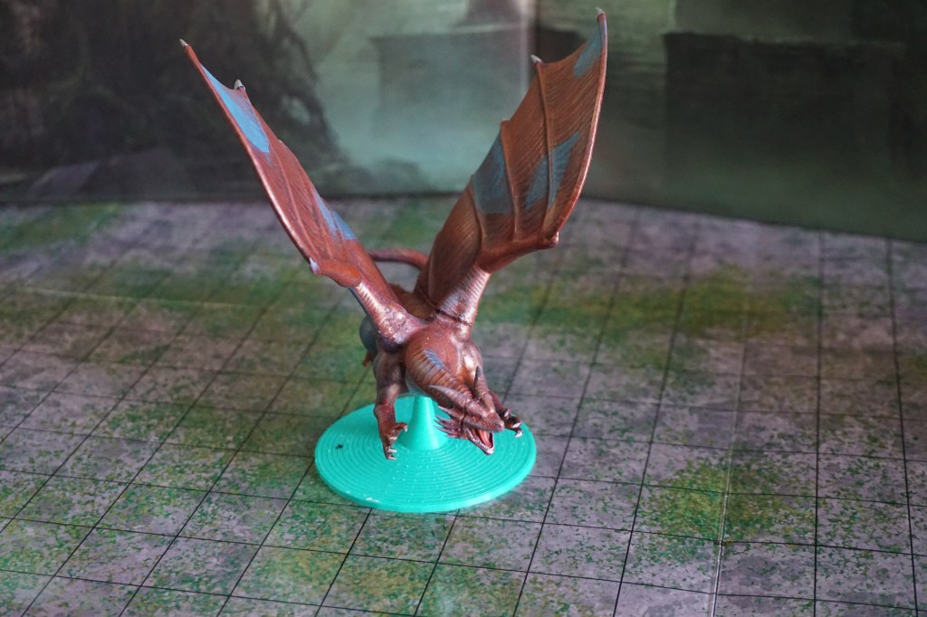
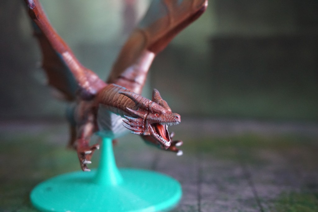
Wanting to bring in an ally the players worked quite hard to earn, the attack by the black dragon brought aid from a copper dragon posted in the area. Though she may seem smaller in form than the black, a copper dragon is actually slightly more powerful. Well balanced against the black, as she also spits acid.
Painting metallic dragons is a different challenge to the chromatics. Rather than having to worry about depth, it is a case of making sure the metal is brought to bear properly. One of the tricks we use is to tarnish them slightly. Here the copper is turned blue in several spots. If I had been willing to put in a few more hours I would have blended the blue tarnish into the main copper work a little better.
The other interesting thing is how metallic acrylics work. In general, I have found that the pigmentation of metallic paints is not conducive to covering large areas. To really get a good colour it is better to paint the non-metallic version first. So for good golds, I’ll use a rich yellow underneath. For a good bronze, I’ll underlay a reddish brown. For the copper I started with variations on red, and then came in with the metallic over the top.
Seldom actually found together, I would be remiss in leaving out the more dynamic shots of these fearsome creatures. Including a staged fight of what it might look like if adventurers were faced with Tiamat. Giving us the scale of dragons to people.
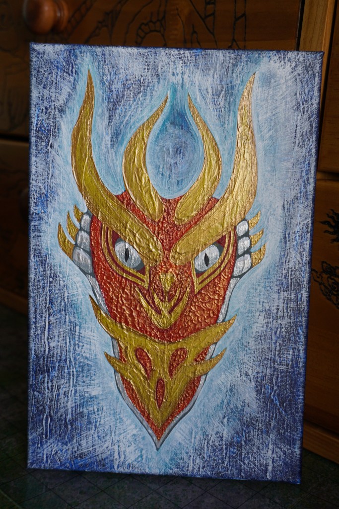
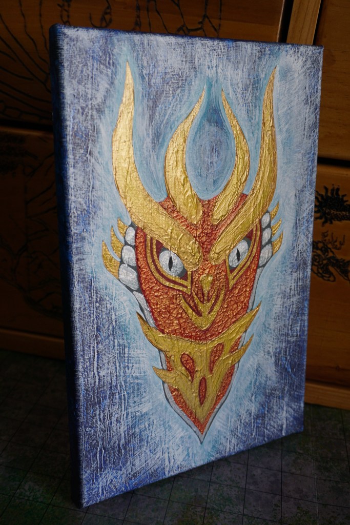
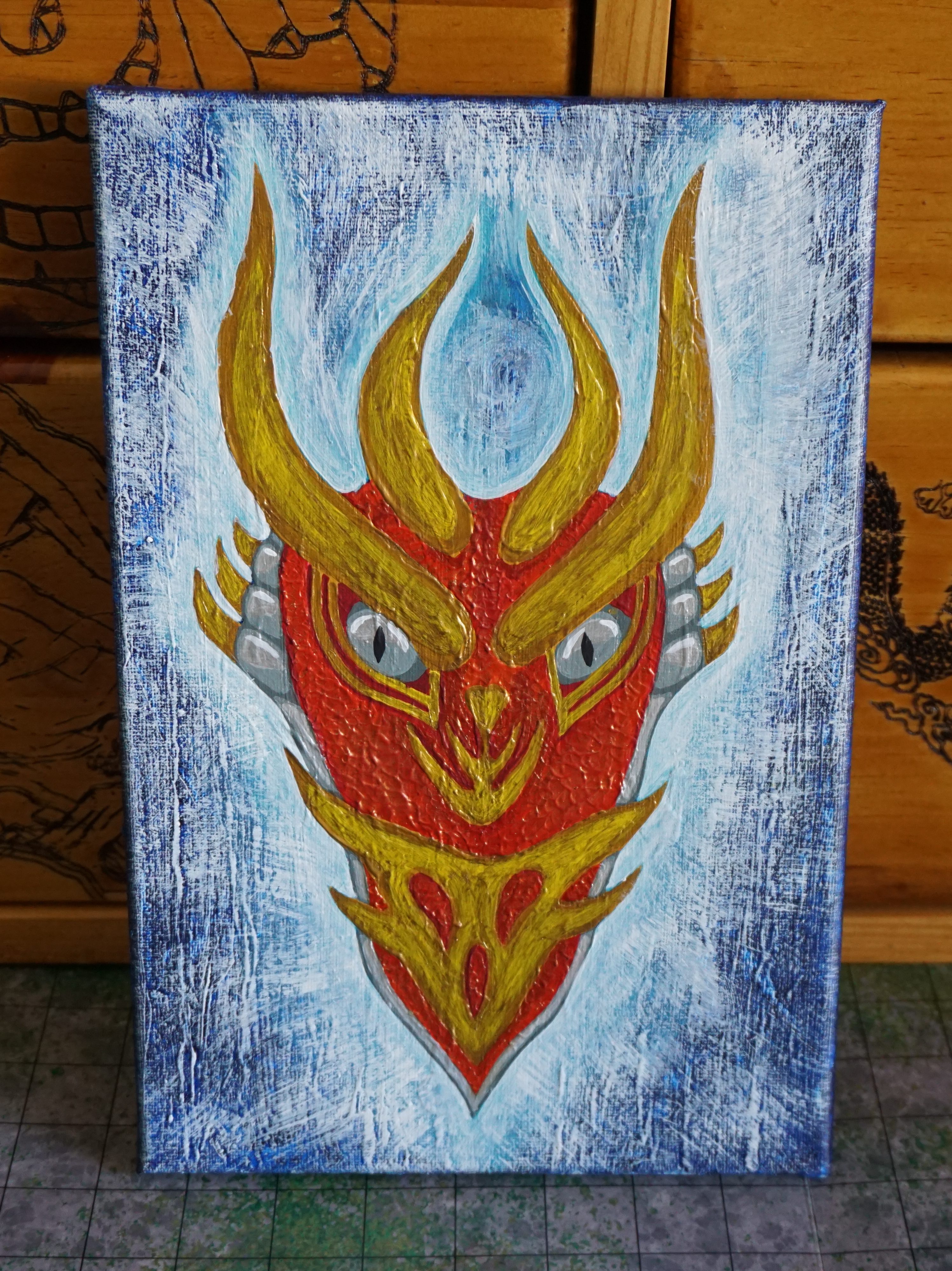
Cosmere Dragons
Brandon Sanderson doesn’t make a big deal about dragons in most of his Cosmere novels. So when I got a little dragon lore from Isles of the Emberdark I grabbed onto it. Even better, that book has lovely sketches of different creatures as the chapter images. Which meant I had a visual from which to work to bring together this most long-lived of entities.
I still don’t have a clear knowledge of whether they are coloured in a specific manner, only really having read about one or two of them. So I took some liberties (hey, it’s fan-art). I also chose to do some experimenting with different techniques, inspired at least a little by some of the art in White Sands.
This is done using acrylic paint on a re-used canvas. The original was a fairly textured abstract piece I never really liked. So I painted it white, and instead brought life to a most majestic creature.